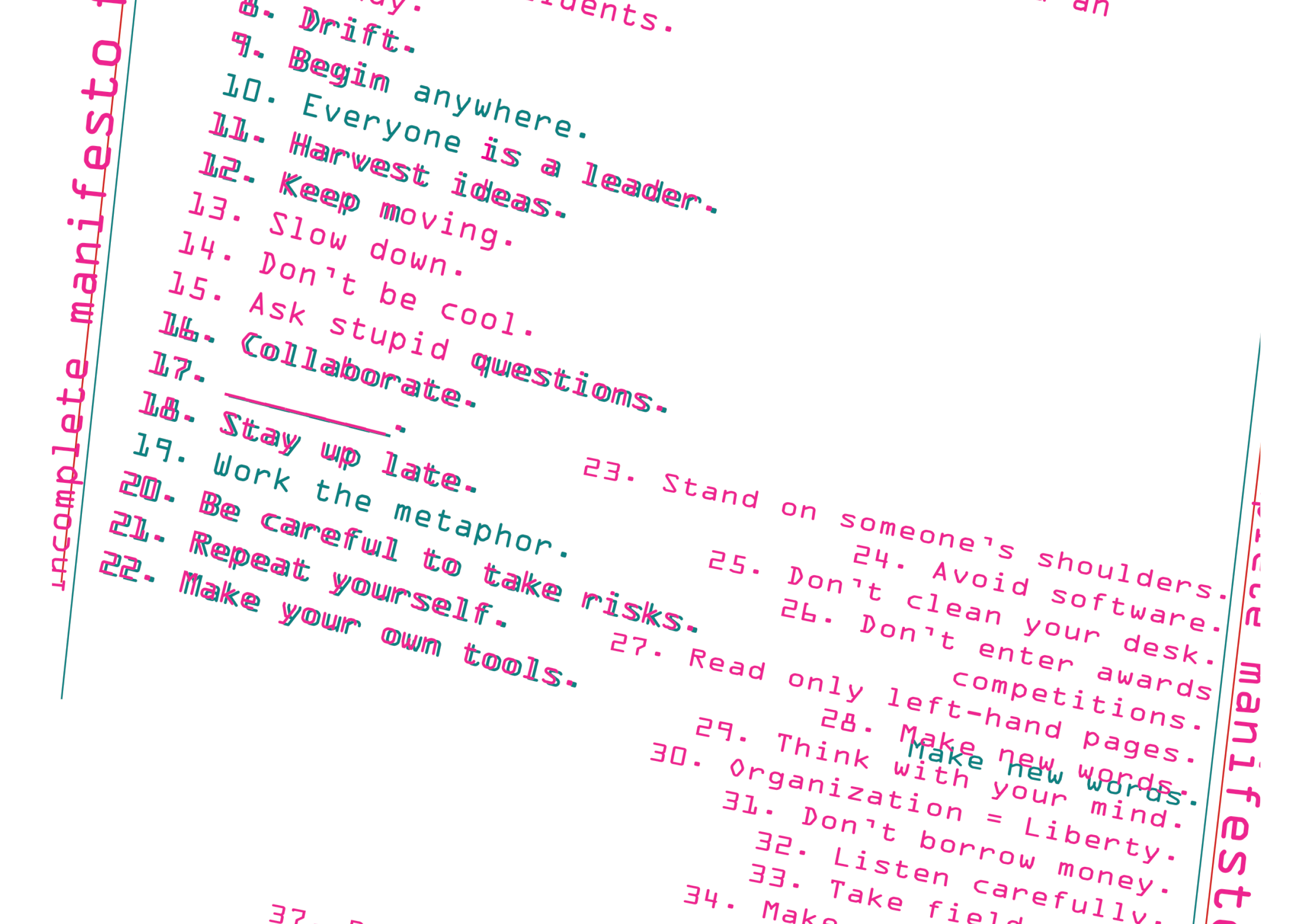
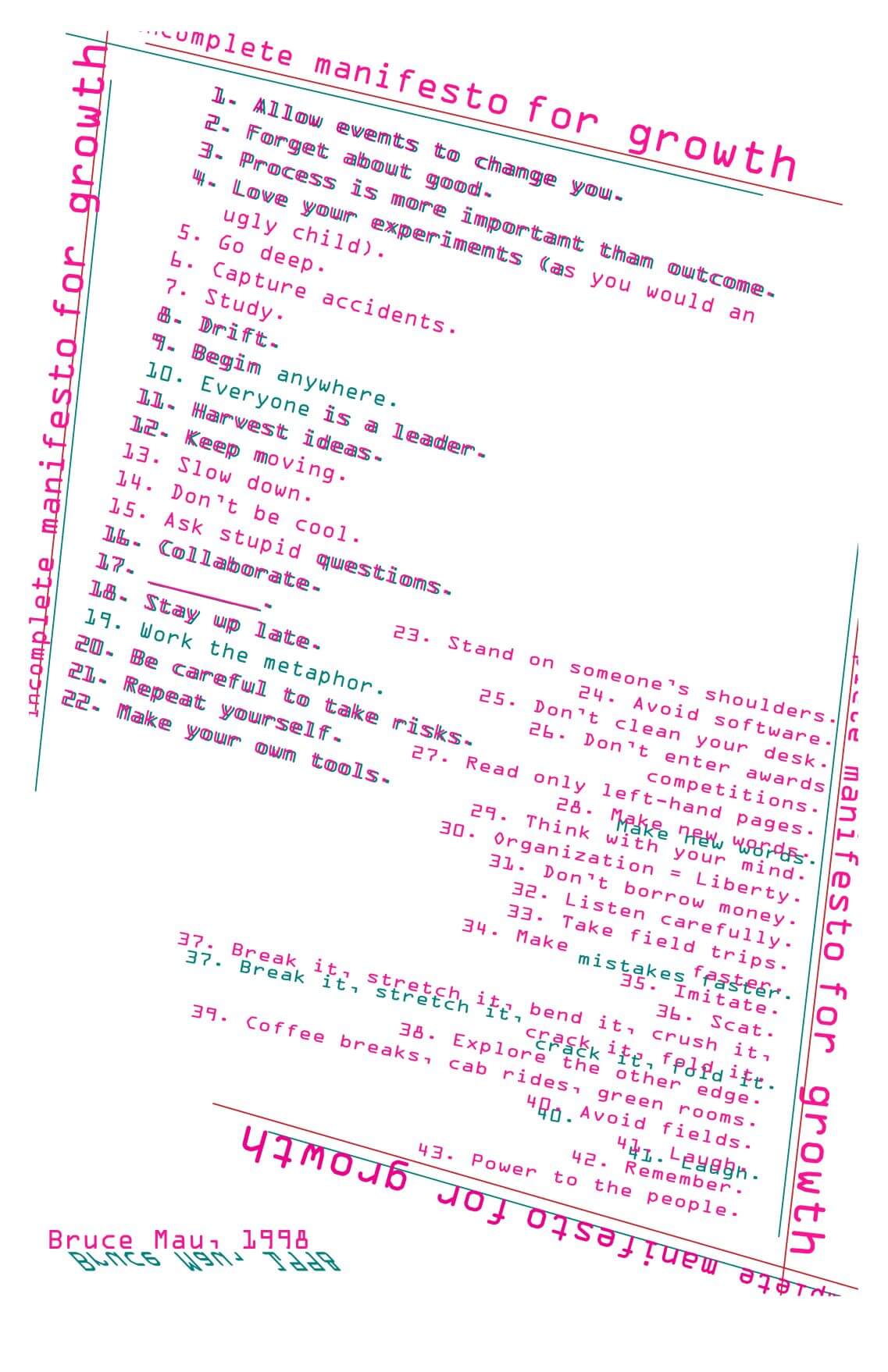
Before designing the manifesto, I first encapsulated the fundamental themes behind Bruce Mau’s Incomplete Manifesto for Growth in three phrases:
1. Break the rules
2. Chase the unconventional
3. Live in extremes; or don't
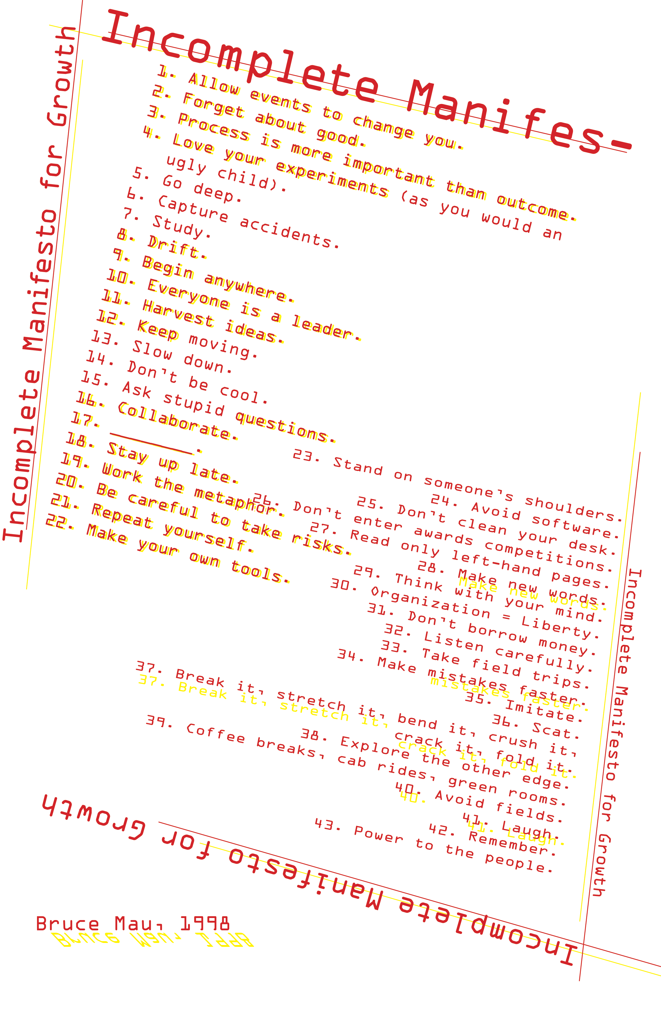
The designs below are manifestations of these three themes, explored through a varied use of lines, angles, overlays, and other components of digital design. The objective of the first set of iterations was to create a wireframe for the manifesto and these designs hence focus more on the creation of a basic structure and layout.
In all three designs, the text has been printed in a variety of angles in an attempt to break free from the conventional rule of design that dictates a hierarchy from left to right, top to bottom. Additionally, the text has been re-arranged to digress from the typical ascending order seen in numerical systems.
A plethora of lines that extend beyond the borders of the page have been drawn to emphasise that the manifesto is, indeed, incomplete as there is no prescribed path leading to “growth” but there exists rather a continuous process that is unique to each individual. These lines are created with different lengths and angles to further highlight this theme.
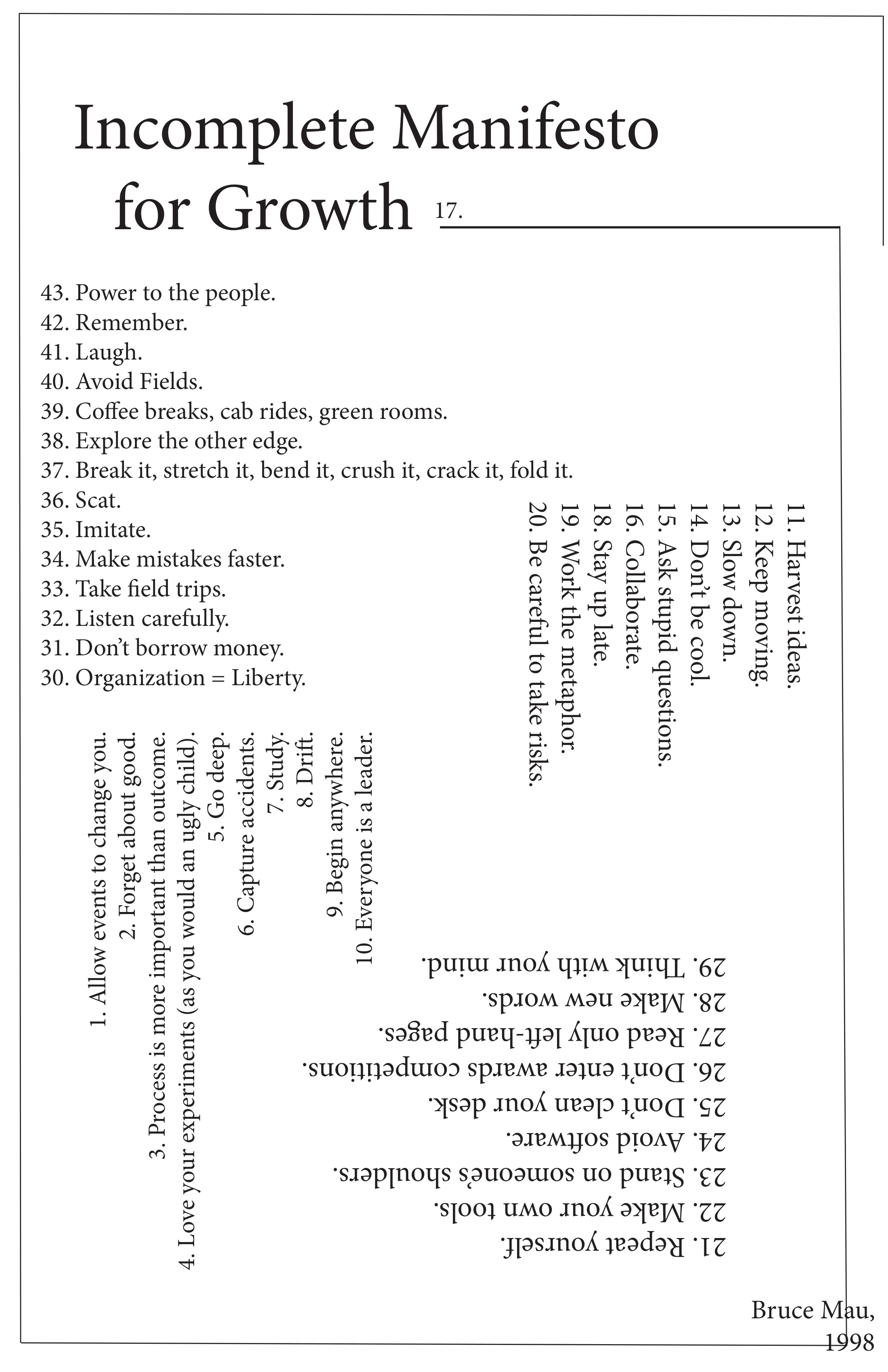
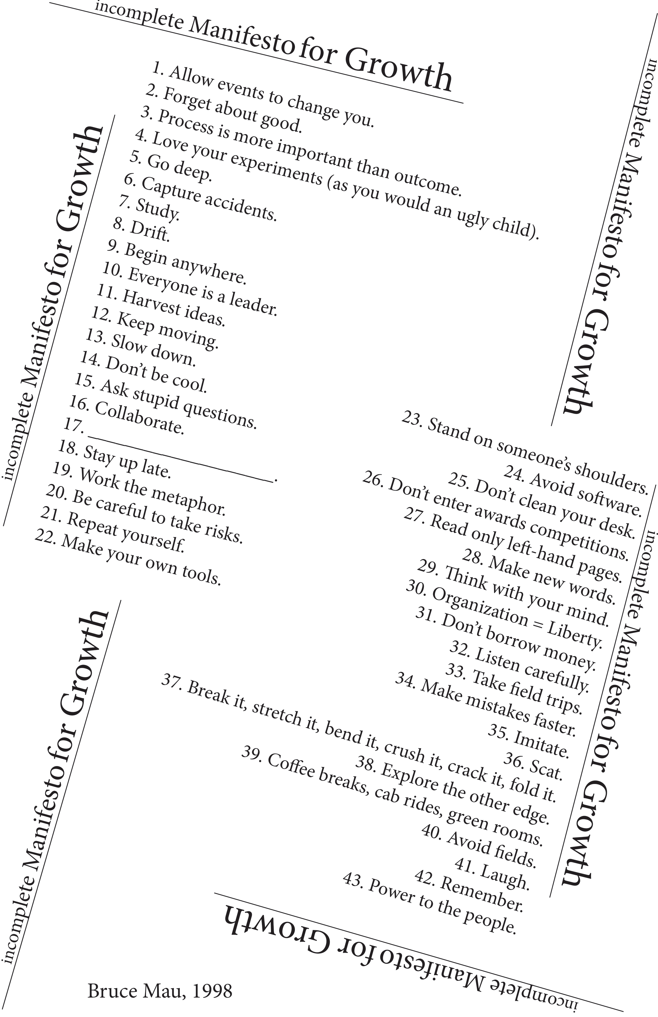
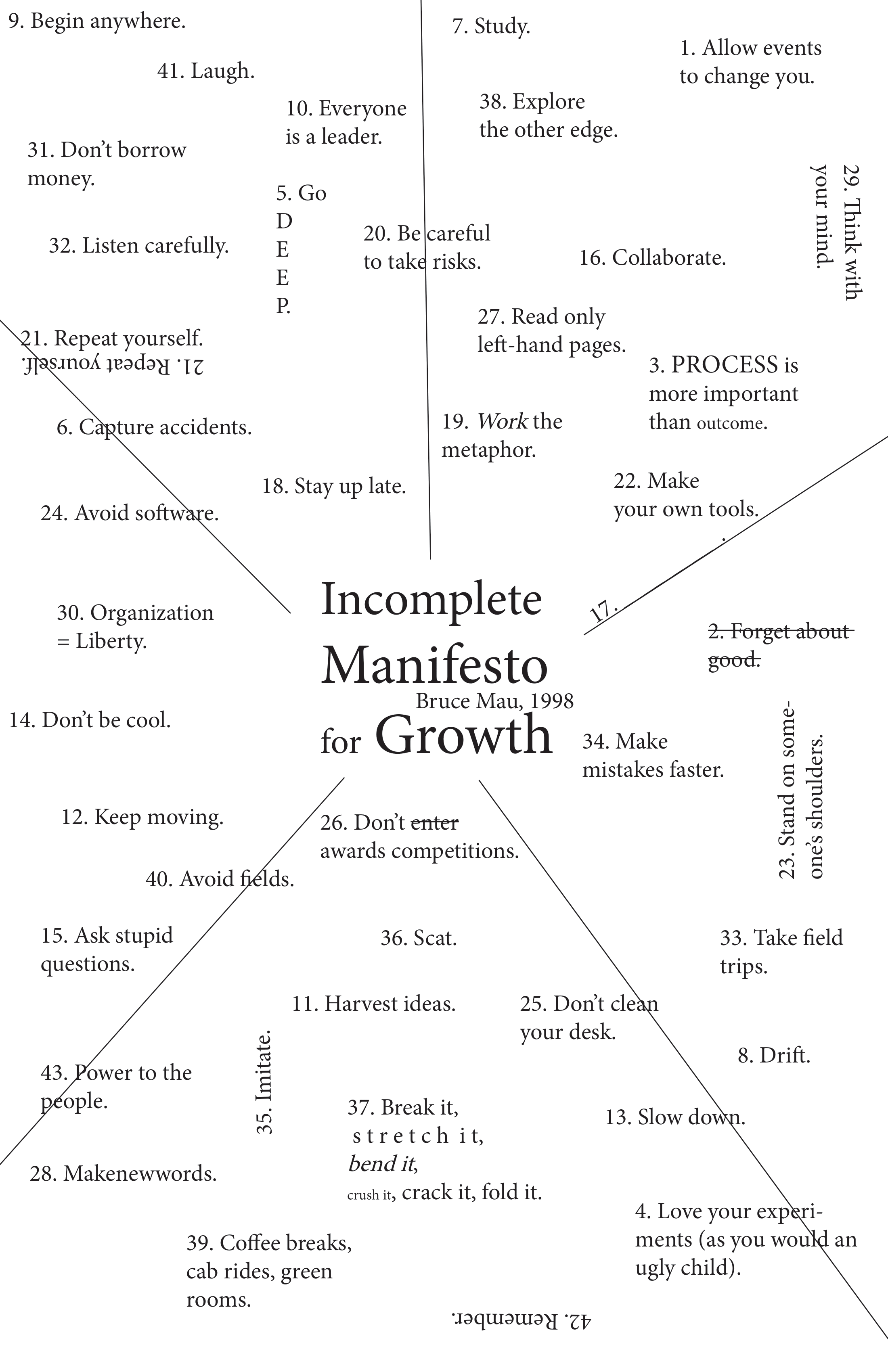
The structures and layouts in this set are a stylistic amalgmation of the previous designs. They explore the aforementioned themes through whitespace, color palettes, and offset-layers.
In addition to the lines and angles, the designs below share offset layers albeit with differing color palettes. The offset has been created to symbolise the gap between individual and society. An individual’s conformation to societal expectations and norms has been depicted by the lack of offset in a few areas. However, these instances should not dominate human life and instead occur in minority.
Whitespace is expored through repetition of the title. In the second and third designs, the repetitions are not always fully legible, illustrating the underlying theme of the list as being a partial rulebook where the missing rules are understood and defined by each reader, individually.
The color palettes highlight the theme of “[living] in extremes” through heavy contrast. In the first two designs, a combination of red and black print against a solid white background illustrates the increased brilliance red exhibits against black than against white. Similarly, in the third design, red contrasts white more than yellow. A parallel is drawn between these observations and an individual’s path of growth.
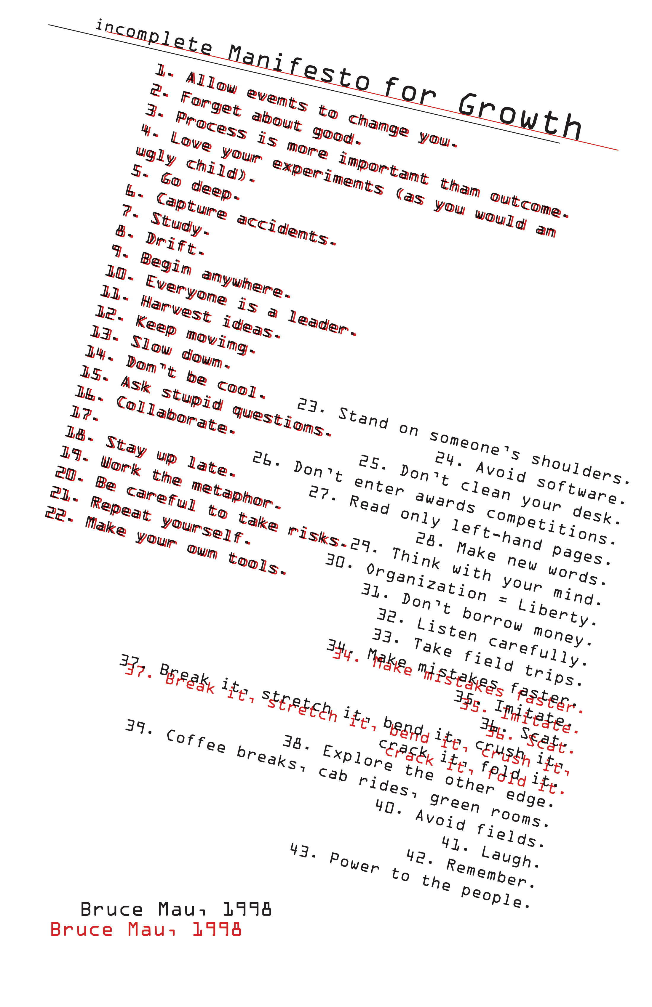
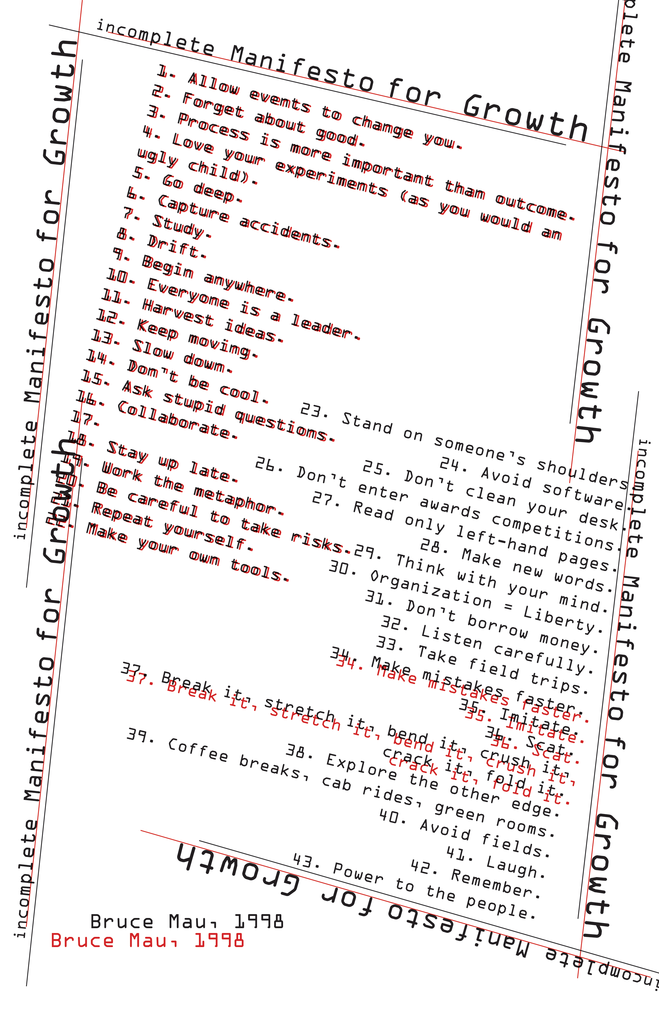
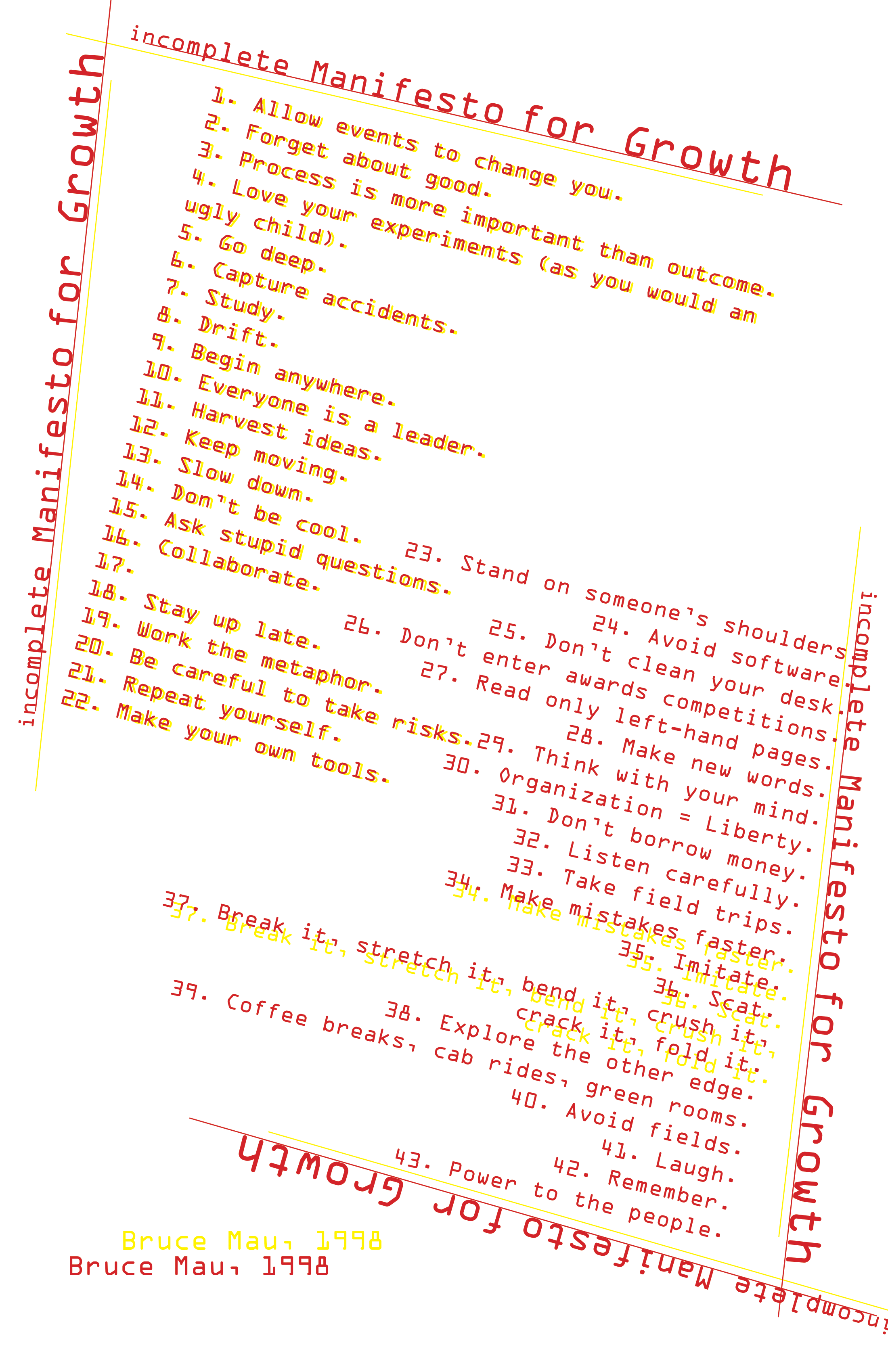
The designs in this set explore the previous illustrations with greater focus towards the more inticrate details such as font sizes, text alignment, and color palettes, alongside a multitude of other details that cumulatively set the tone for the final manifesto design.
A notable change in layout is seen in the bottom left; previously, “Bruce Mau, 1998” was printed with an offset, but has now been replaced with an angled reflection. Although the offset signalled a gap between individual and society, the angle of the reflection illustrates that the manifesto is not a perfect portrayal of Bruce Mau’s ideologies and mental models, but rather a work in progress.
A range of font-sizes has been used in these designs, exploring the importance of assigning weightage to the different facets of an individual’s growth. The line crosses through the title to, once again, portray how the manifesto does not dictate a perfect recipe for growth but rather creates a unique mental model.
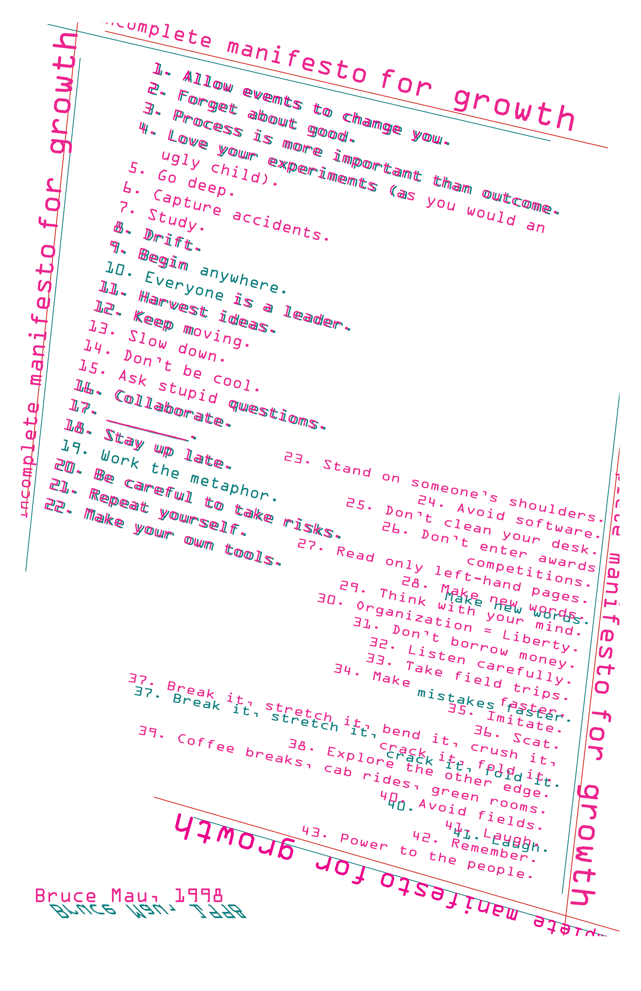
The final color palette employs tones of pink and blue as these colors are in balance ie no color overpowers the other. Moreover, when overlayed, they create a new stronger tone, akin to how Bruce Mau’s manifesto could lead to exponential growth when combined with an individual’s own perceptions and perspectives regarding the rules, or lack of, of life.
