18th July - 25th October
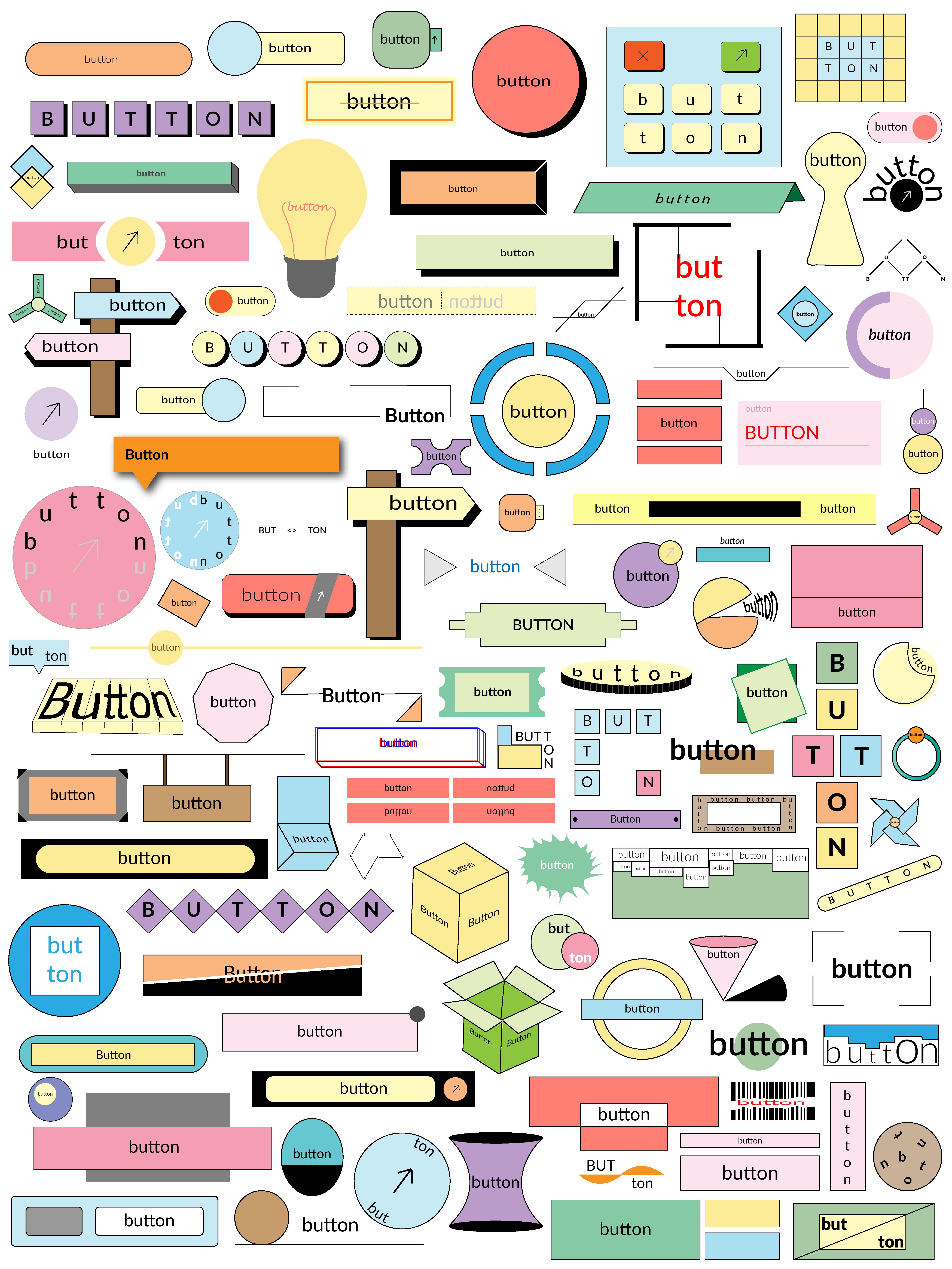
This page includes each of the hundred buttons, in a variety of colors and sizes.
18th July - 6th August
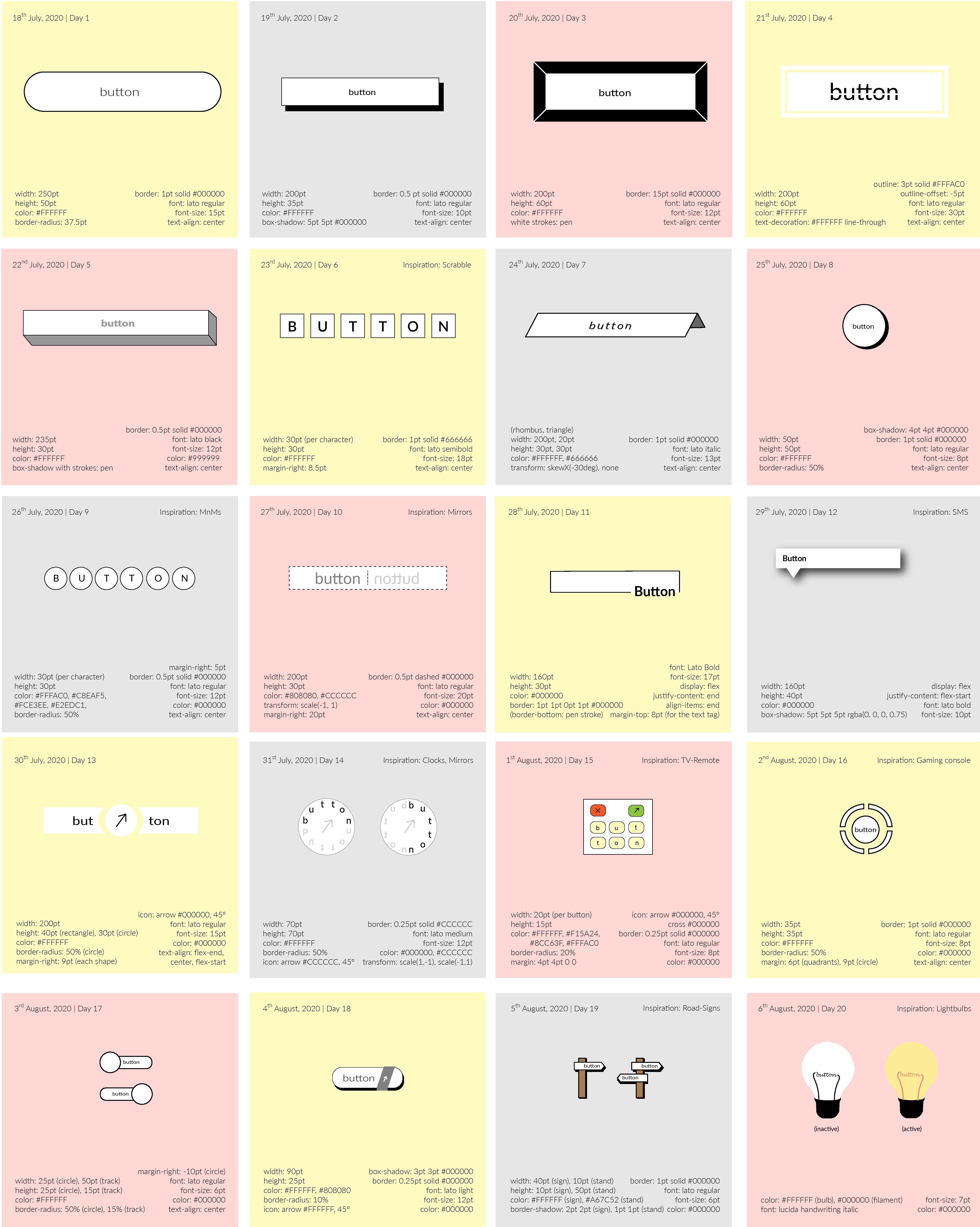
The objective of the design challenge was to break free of my mental barriers to design and push my creative limits.
To ensure I didn’t detract from this objective, I used only one typeface — Lato.
Moreover, to challenge myself further, I noted the css styles required to create each button design as well.
I began with exploring rectangular and circular designs, toying with the three-dimensionality of the button via shadows, lines, and color. Over time, my designs grew more illustrative, reminders of objects around us.
7th August - 26th August
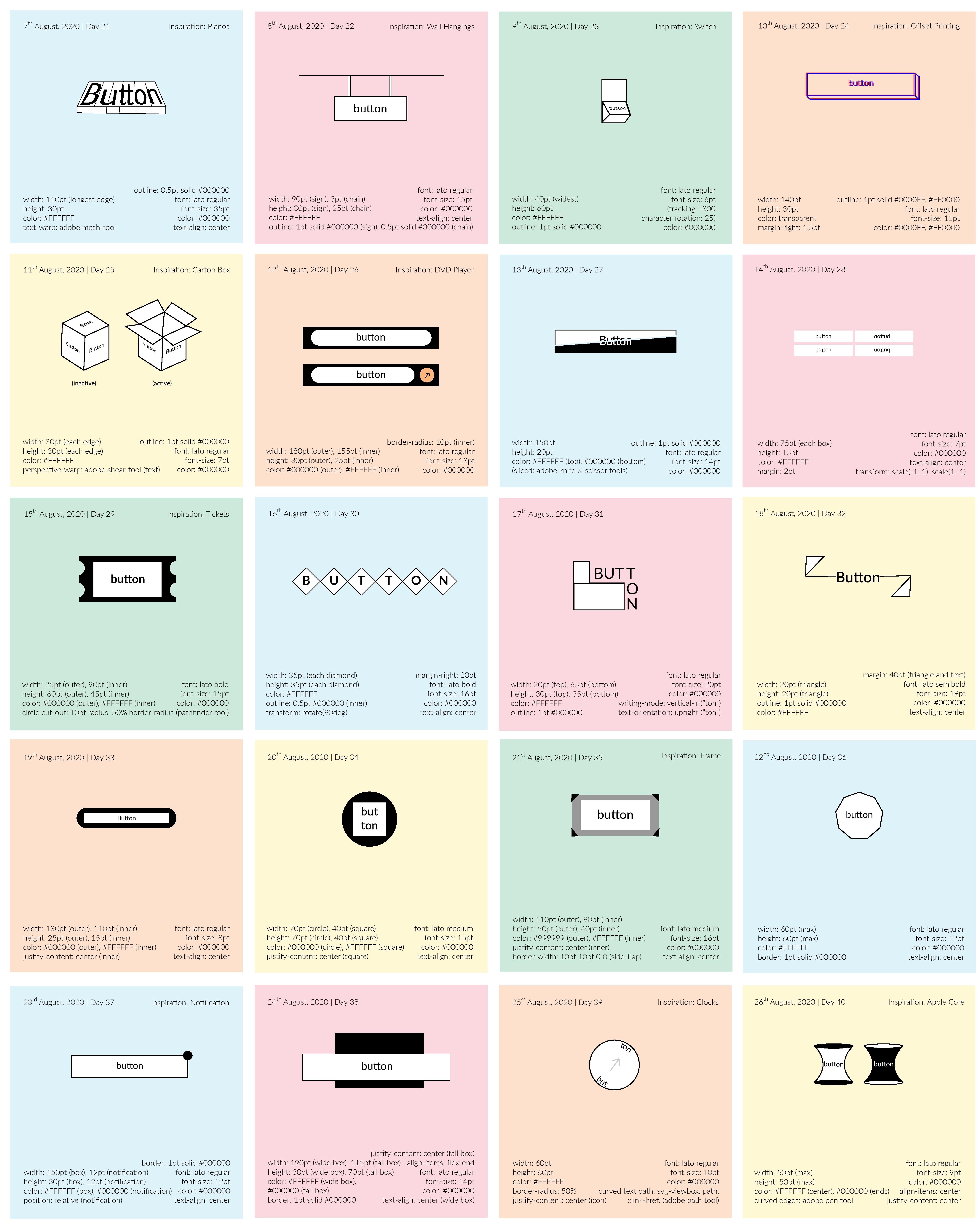
During this period, I continued with my illustrative streak; the first set of buttons were inspired by pianos, wall hangings, carton boxes, DVD players, switches, and tickets.
Towards the latter half of this period, the designs toggled between abstract and illustrative, although a larger proportion were more abstract that illustrative.
With the button created on day twenty-six, I broke free of a mental barrier by containing a round-edge rectangle within a sharp-edge rectangle. Hereafter, numerous button designs embraced differently aligned edges in the outer and inner containers.
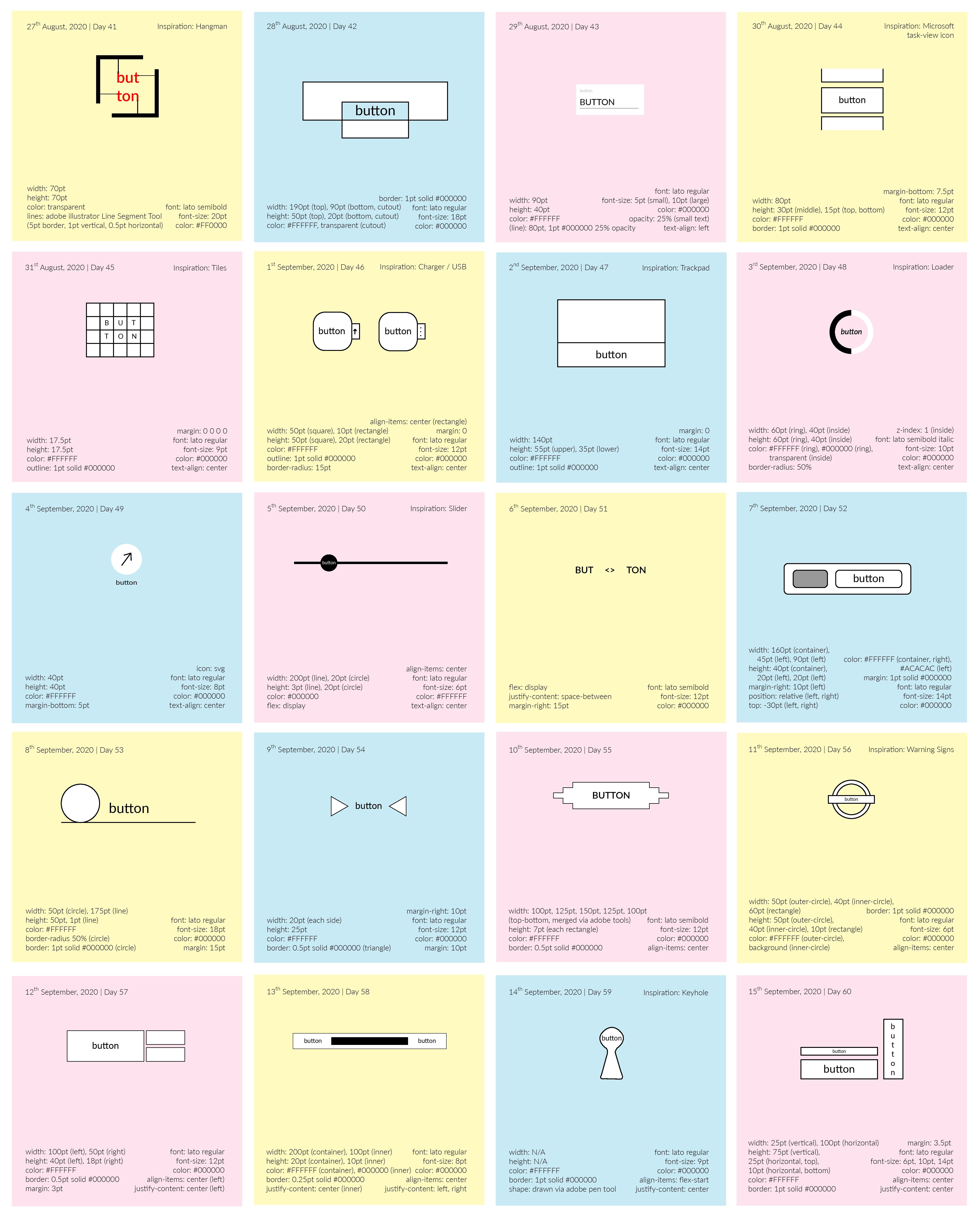
27th August - 15th September
During this period, I continued creating designs that balanced illustrations and abstractions.
Towards the latter half of the period, the designs appear to be conjunctions of regular shapes, such as rectangles, circles, and lines, in different arrangements.
With the button created on day ffity-one, I broke free of another mental barrier by designing a border-less button. Hereafter, numerous button designs embraced border-less patterns as they grew increasingly abstract.
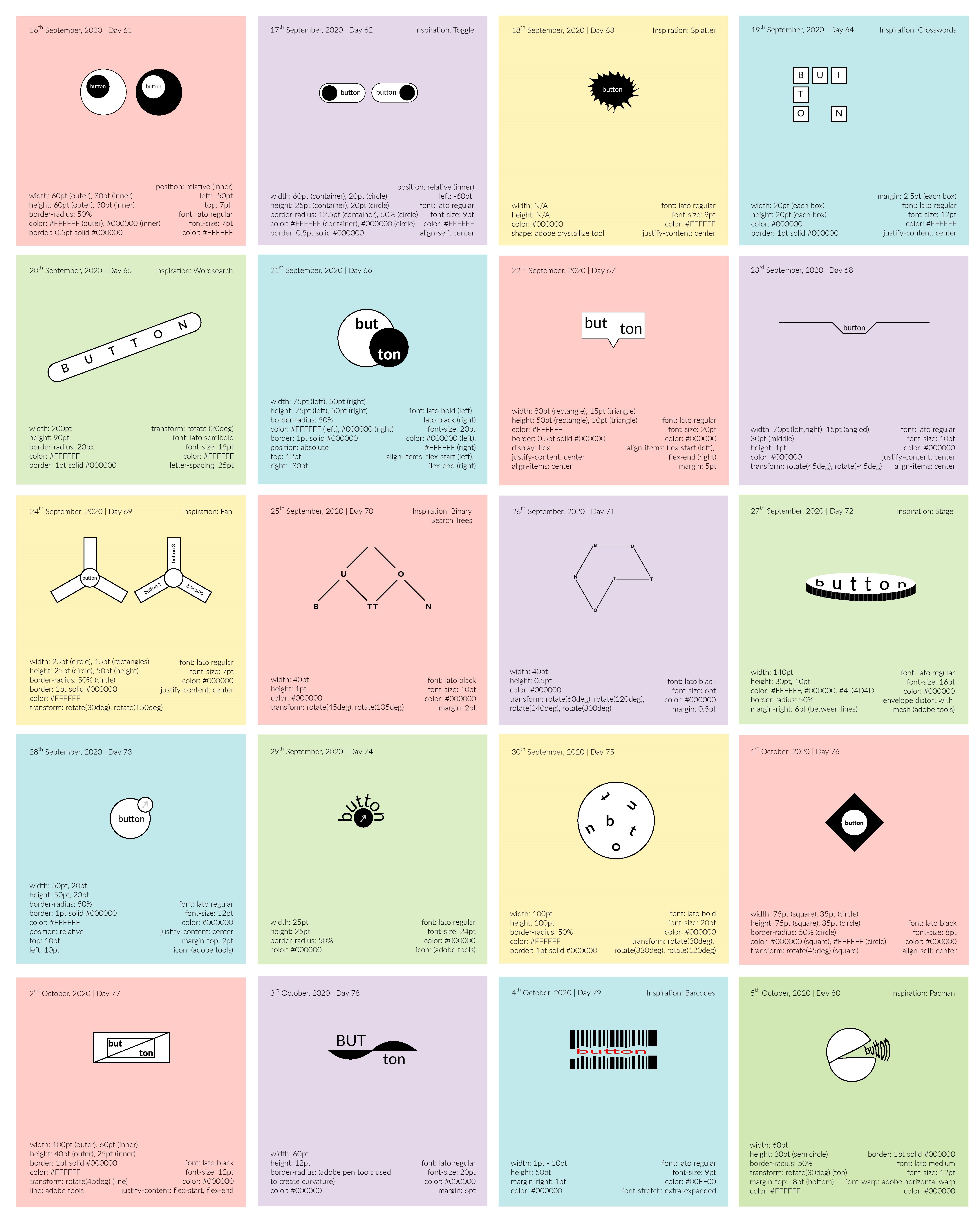
16th September - 5th October
During this period, I continued creating designs that balanced illustrations and abstractions.
Although minimally, I explored typography in design through the buttons created in the latter half of the sprint. With this I leveraged typographic elements such as kerning, white space, and contrast, to drive experiences and evoke emotions.
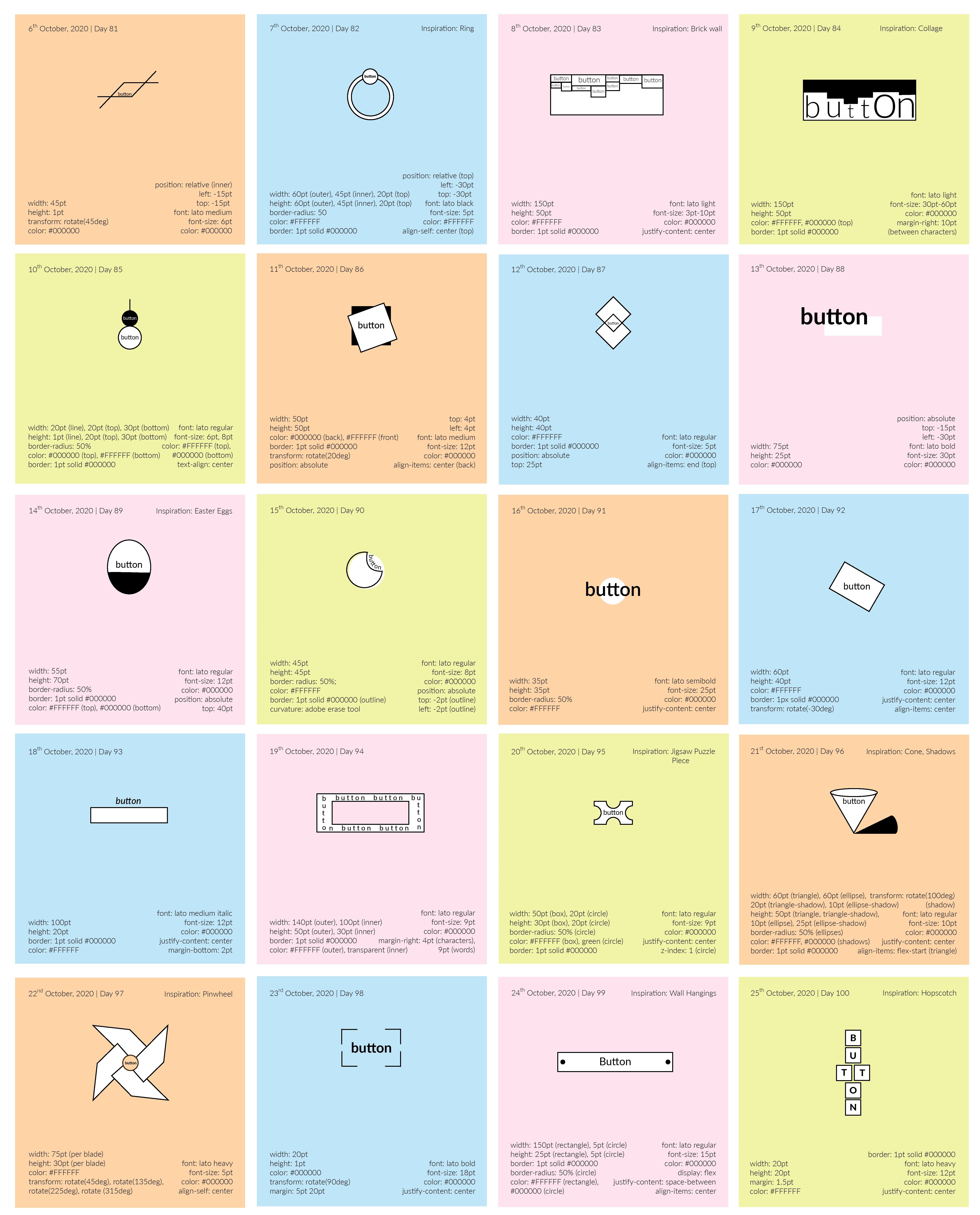
6th October - 25th October
During this period, I continued creating designs that balanced illustrations and abstractions.
This sprint represents a clear juxtaposition between simple asbtract design, and complex illustrative design. The designs on day ninety-two and eighty-three pose a paragon for this contrast.
WEB DEVELOPER : CLIENT
tech, work
CRAVE
tech, entrepreneurship
